What is the class?
Graphics I is all about digital illustration along with the history of how we got to this point using paper ink and different machines. Coming away from this class I have picked up a lot of useful skills like the ability to create small practical thumbnails, design that capture the eye of potential customers/the general audience. I have also picked up a number of life lessons which has increased my work ethic and helped me grow not only as a student but as a person.
Olympic Symbol Project
The Olympic Symbol Project was our first real project that used the software, it allowed us to think outside the box and challenged us to create a new logo using only simple geometric shapes for an olympic sport of our choice. We were also challenged to add one effect of some sort to our logo, I chose to do a gradient, a shadow effect, and a brush stroke. I chose the olympic sport of Skeleton as I thought it would be an interesting sport to get some cool action shots in. We did a hand drawn, greyscale, and a colored version of the drawing.
History Poster
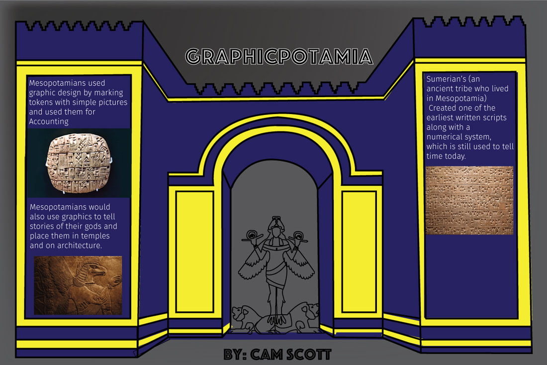
This history poster project had us design a simple poster displaying some graphics and texts about an ancient civilization and their impacts on modern day graphics, I chose to do Mesopotamia. I believe this project was ok overall, but definitely not my best work. The colors I chose were nice however if I were to do it again I may lighten the blue and darken the yellow to allow a better mixture of color. I would also redo my text as it is the basic default font and is unattractive.I enjoy the graphic itself however and as I said before it is ok overall, but could use some touch ups. I do however look back at this and I do feel proud about how far I have come since I did this project, and that is my main take away from this project. We did this project not only to practice more on illustrator but also so we can learn more about the history of graphics by researching it ourselves.
Monogram Project
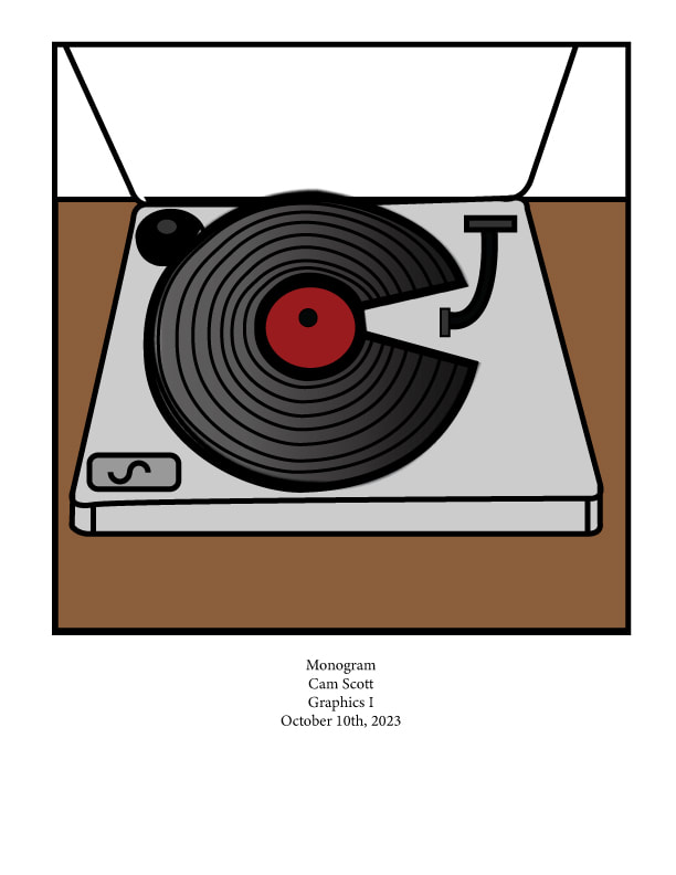
The monogram project was a fun project where we had to design ourselves a monogram and incorporate a hobby or interest into the monogram. We had much more creative freedom here than we did in the previous projects as we were able to openly choose the design instead of having to choose from a list. Personally I love collecting vinyl records with my dad so I incorporated that into my design by making the turntable and record. I think the colors all blend nicely and my one change would be fixing the record lines. The goal of this project was to help us learn more about typography in design so we were tasked to design out own monogram graphic which is at least two of our initials arranged to make a graphic. The letters in my design is C as the record, J as the needle arm, and S as the volume knobs.
Children's Maze Project
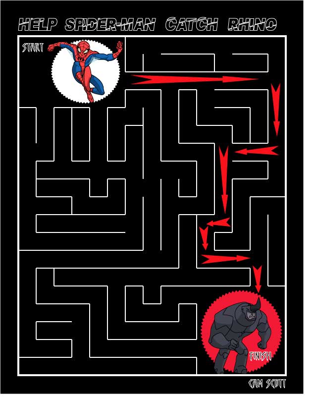
In this project we had to design a children's maze that would really draw their attention. I made mine have multiple solutions in order to decrease the difficulty for them. I chose to do Spider-Man as I felt that would be a great choice to rope in kid's attention so they would pick this maze over another one if presented with a choice. I chose to do the black background as I thought it would stick out more than most and because it contrasts well with the bright blue and red of Spider-Man. This project taught us to think about our audience demographics when creating a design.
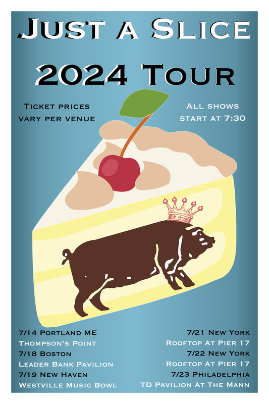
Logo Project
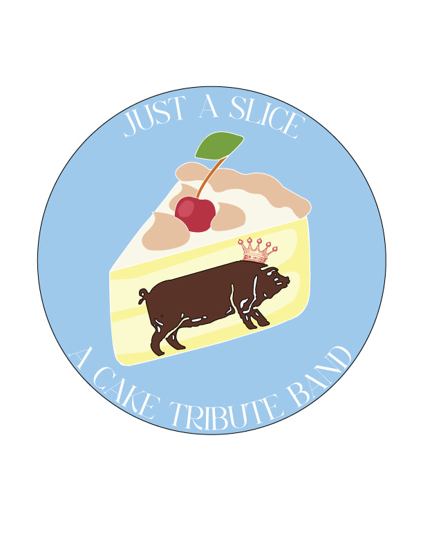
The logo project was a project that really unleashed our creative minds, not only having to design a logo but create an entire fake company for said logo. I however chose to create a logo for my CAKE cover band, "Just a Slice." Having creative freedom on this project felt amazing and upon completing the logo I felt proud and had a sense of accomplishment with it. Our goal in this assignment was to create something that pops and makes you want to look at it, but also simply enough that you can decipher the meaning in a few seconds. This is one of my top three projects we did in this class.
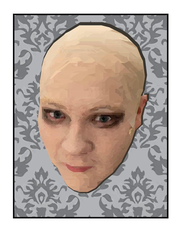
Low Poly Self Portrait Project
This project had us play around with the trendy low poly style by creating our face as a low poly graphic, then placing it on a classic style wall paper. This project took a lot of work but I believe the work was worth it as the final result is beautiful. The project's goal was to help us think about what trends are currently happening in the design world so we can use them to our advantage when creating a design.
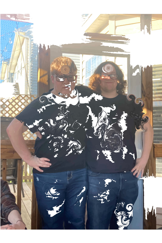
Screen Print Projects
The digital self portrait project was our first exposure to screen printing, it was a simple project where we found a picture of us and printed it onto Casey's and burned it onto a screen. We then masked the screen and printed the image onto some card stock paper, and put a matte board around it. The T-Shirt project was our second exposure to screen printing where we did the process of burning an image onto a screen and printing it, however with the t-shirt project we were able to choose/create any design we wanted and put in on a t-shirt instead of card stock. I ended up doing two different designs onto t-shirts, the second time more independent creating a more personal design for the shirt. This is another project where we had complete creative freedom allowing us to put any design on to the shirt, as long as it was appropriate.
Event Poster Project
This was our final project which allowed us to create a concert or event poster for either a real or made up event. I chose to design a concert poster for my CAKE tribute band that I also designed my logo for. After sketching out a few ideas, I settled on reusing the logo I designed previously and adding a gradient background along with the text explaining everything consumers need to know.
Two Tutorials
Using these two online tutorials I was able to go back to some skills I hadn't used and create something I think is pretty cool looking. Using the image tracing and warp tools I was able to create an image that seems to be reality warped like something straight out of a sci fi comic. This here is the tutorial that refreshed me on how to use the warp tools and image tracing once more: www.youtube.com/watch?v=Ib8UBwu3yGA
Closing Statements/Takeaways
While in this class I took away many things such as learning to think about demographics, audience, the elements of design, how to work illustrator and how to properly draw a thumbnail. As always I have also learned a great deal of life lessons such as working to do the best work you can, self respect, working for what you want, and focusing on deadlines from this class. Overall this class was a great learning opportunity and a fun time making this class one of my new favorites. Have a great retirement Mr. Z!!
